What is the ultimate goal of Meogic?
Meogic is software designed to help users better manage information, understand concepts, and ultimately improve themselves.
Our current approach is: To build your personal information system naturally and quickly in a note-taking outline application, both from the bottom-up and top-down.
Let's break down these concepts one by one.
Bottom-up: Making Recording Effortless
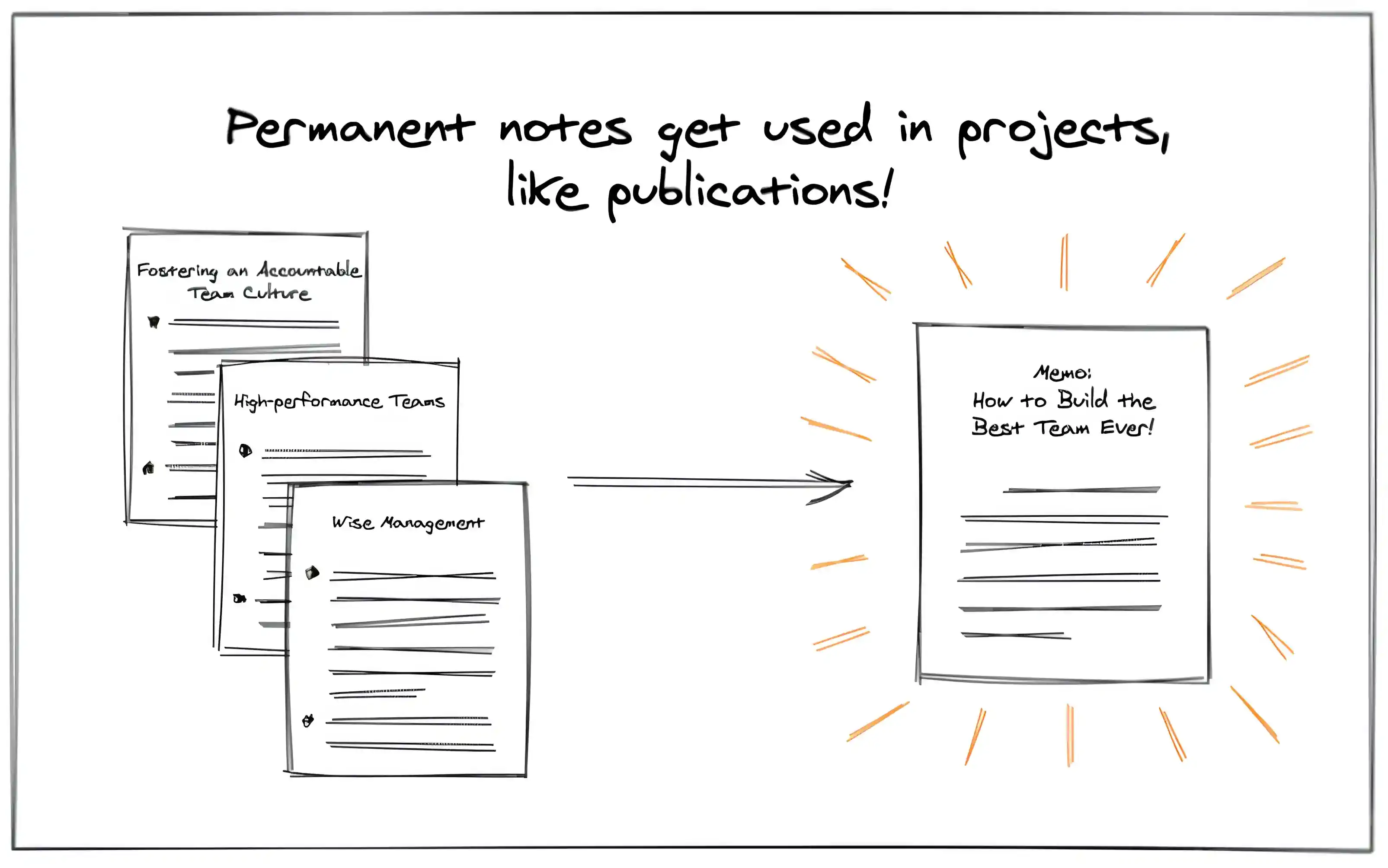
As a front-end engineer, when I encounter a useful experience at work, I want to quickly jot it down so that I can accumulate knowledge and enhance my skills over time.
With ordinary note-taking software, I might have to think about which folder to place this note in. Should it go under "Front-end" or "Front-end Tips"?
Wait! I suddenly realize there are two subfolders: "Front-end Tips" and "Front-end Issues". Where should I put it?
- Front-end
- Front-end Tips
- Front-end Issues
Besides categorization issues, there are formatting concerns:
- This should be a title
- That should be a detailed note with a new subheading
- ...
You might have faced similar issues. The primary goal of note-taking is to be quick and effortless, but the process described above can be quite frustrating.
This is where the note-taking outline comes in to solve the problem!
Note-taking Outline
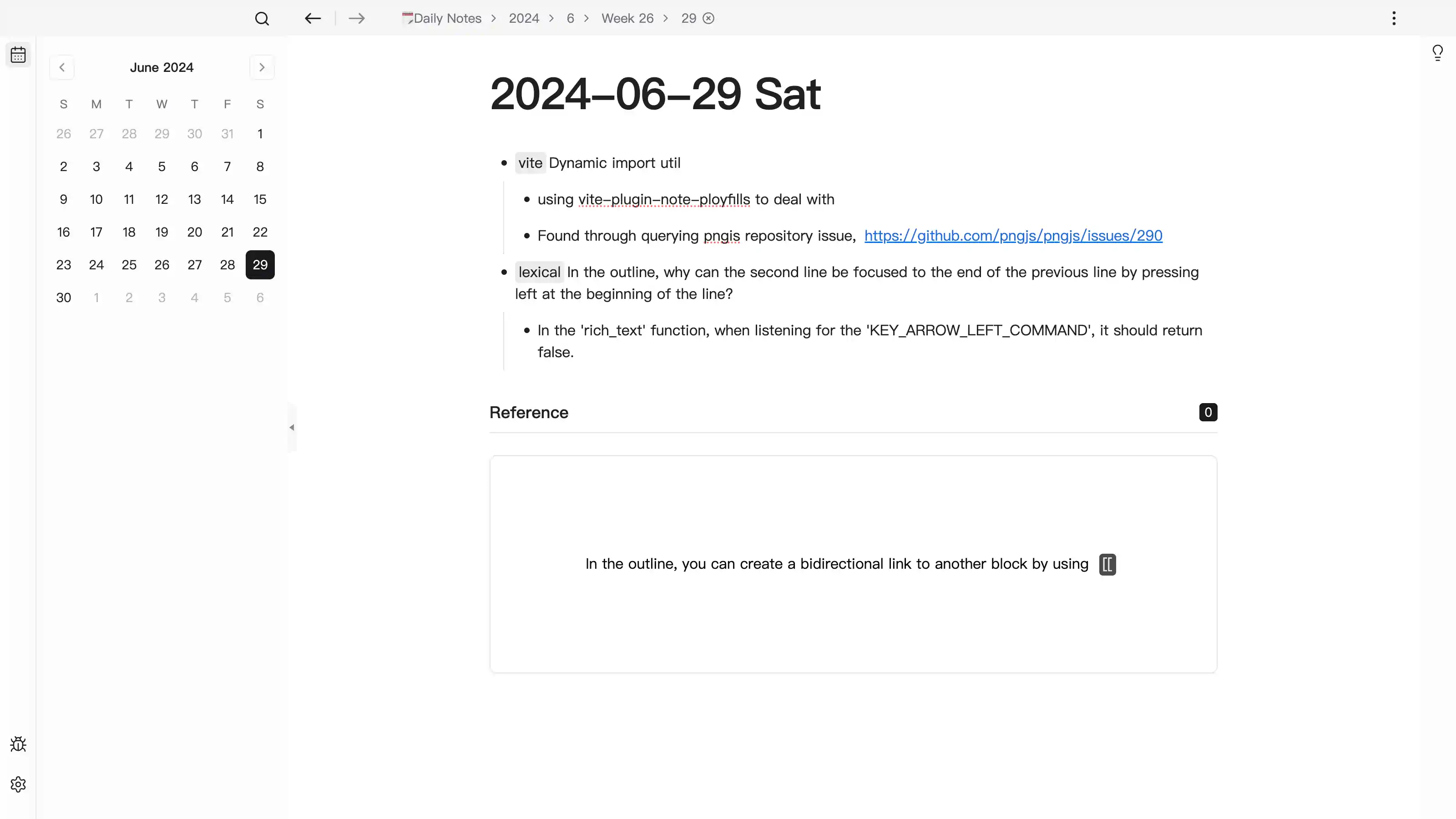
In a note-taking outline, you only need to record your notes on the daily page. For the same topic, simply use double-linking.
Over time, all related notes on a topic will automatically appear on its back-link page.
For formatting, you can use markdown shortcuts to quickly apply the desired format, making the note-taking process seamless.
Additionally, while recording, we often add multiple levels of detail, sometimes as "detailed information" and sometimes as "temporary thoughts".
- [[vue]] error: TypeError: Cannot read properties of null (reading 'insertBefore')
- Trigger: Teleporting to a div, and the nodes under the div change with an operation, causing the "relative mount" effect to fail, thus triggering the error.
- Details: https://github.com/vuejs/core/issues/10870
- This appears to be a bug within vue, and others have encountered it.
- Quick Fix: Insert an empty div at the end of the mounted div.
In this case, you only need to press Enter and then Tab to add an indent. It's as simple as that.
Moreover, this tree structure helps develop a hierarchical thinking habit, making our thought process clearer.
Top-down: Taking a Broad View, Making Everything Orderly
After building your information library with the above features, you might find it turns into a mess.
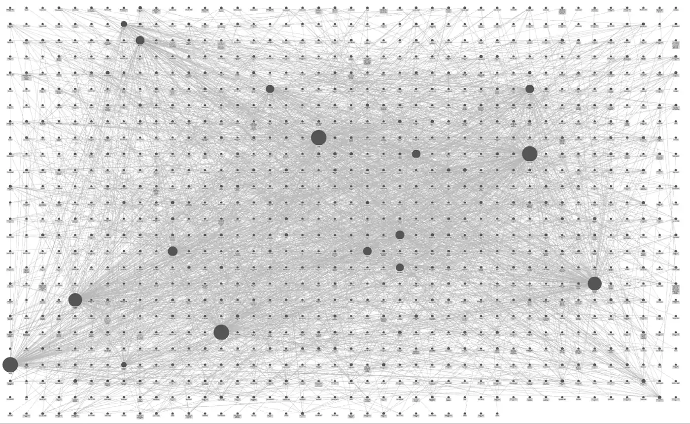
It can be unceremoniously called a garbage heap. How do we solve this problem?
The following three tools might help.
Focus
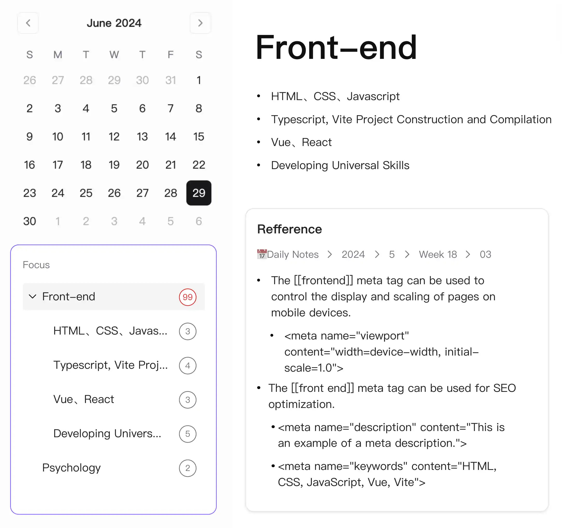
This tool can count content that meets certain conditions, one of which is the number of times you double-link a topic. When it exceeds a certain number, it turns red.
Here's a scenario:
After using the app for several days, you've recorded a lot about front-end development. One day, you wonder if there's too much related content?
You check and see there are only five or six entries, but what about the future? You notice an icon next to the title.
You drag it to the focus area below the calendar, and it gets fixed there, counting the number of front-end related links.
As the number of links increases, the count turns red.
You might notice that we subconsciously create many topics with clear parent-child relationships.
Today I linked to [[front-end]], tomorrow to [[network debugging]], and the day after to [[vite packaging]]. But they all fall under the broader topic [[front-end]].
If I perform the same operation for each topic, it would be too cumbersome. So, we only need one for [[front-end]], and the content below can be automatically counted.
Kanban
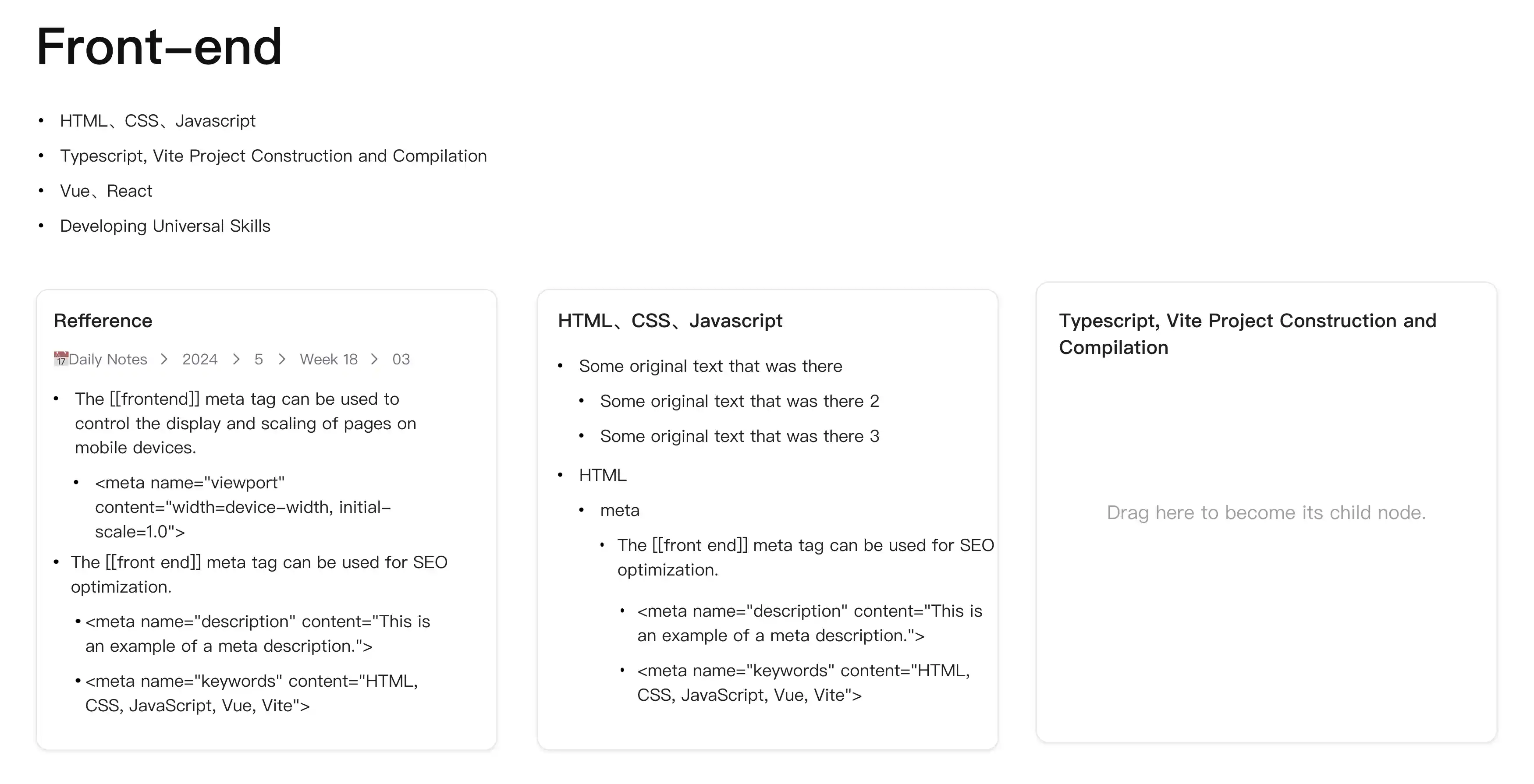
The previous step gathered our somewhat messy content. The next step is to organize it, aiming to add it to the corresponding topic as sub-nodes.
The current page layout is a continuous flow, which isn't ideal. If the backlinks are too long and exceed the screen, it becomes hard to interact.
Initially, I thought that when you find a backlink belonging to a topic, you could drag it over. But this becomes cumbersome with more entries, leading to frequent and tiring operations and potential misoperations.
This made me think, what interaction is natural for users when organizing?
The answer is: box selection and drag to different areas.
Specifically, it's the Kanban.
In the backlink view, it can be expanded into a Kanban view. Then, a new area can be added on the right, defined as organized. You only need to drag from left to right, which is very convenient.
Wait, aren't we supposed to assign to sub-topics? Indeed, the above might be a basic scenario. Many past notes were roughly written and need further processing.
But a more advanced scenario is to classify the recorded content more finely, such as some content linked to [[front-end]] being subdivided into [[network debugging]], [[vite packaging]].
So, when adding a new area, the content you enter can be a searched block.
When you throw in a piece of content, it automatically becomes its sub-node.
At this point, most sorting scenarios should be satisfied. But something still seems missing. Remember the "garbage heap" mentioned earlier?
Bird's Eye View
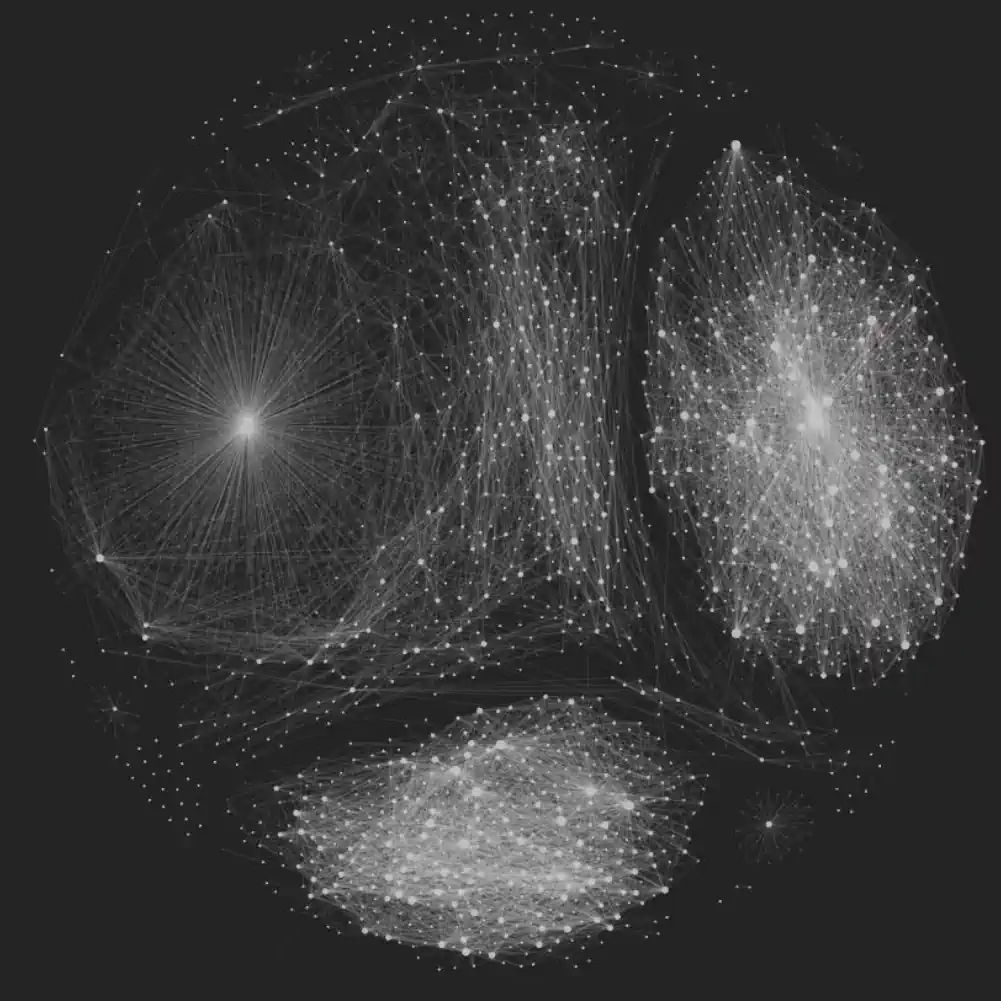
Why do some double-link note-taking software have such a view? One reason is to make your content more connected. But a bigger reason, as I observed, is to satisfy the user's desire to share.
The more complex the content you record, the more concentrated certain topics become, creating a kind of beauty.
Sorting itself is a process from disorder to order. The bird's eye view we provide should reflect this.
The more users organize, the more orderly and beautiful the view becomes.
Oh, by the way, inspired by the old iMac (1998), we should make it colorful, not black and white like the one above.
Contact Us
| Address | |
|---|---|
| service@meogic.com | |
| Discord | https://discord.gg/vhaFXHBk5z |
| https://twitter.com/MeogicAPP | |
| Feedback | https://meogic.canny.io/ |